Hybrid Arts Lab: Rapid Fire Text


Rapid Fire Text
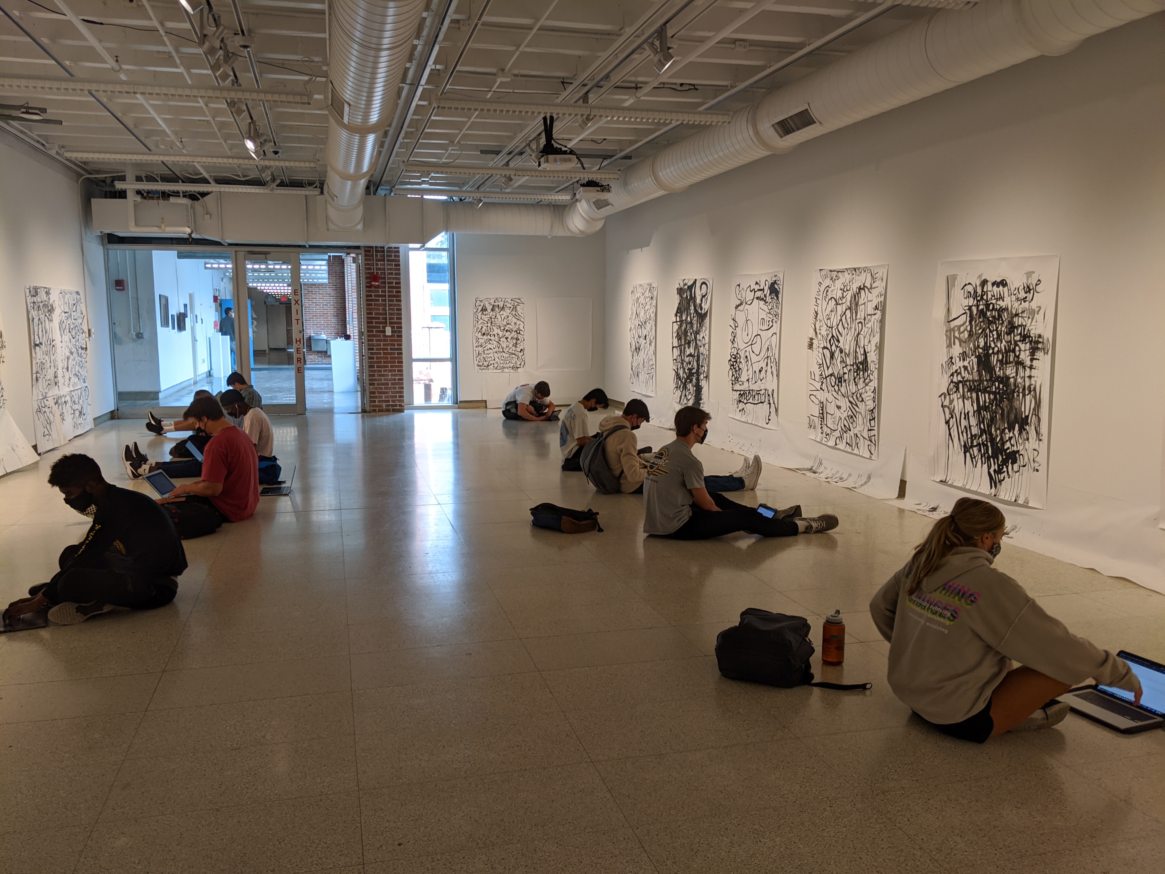
Exhibition in Hopkins Hall Gallery
September 8-21, 2020 | 11:00AM-4:00PM
Online Exhibition
September 14-October 2, 2020
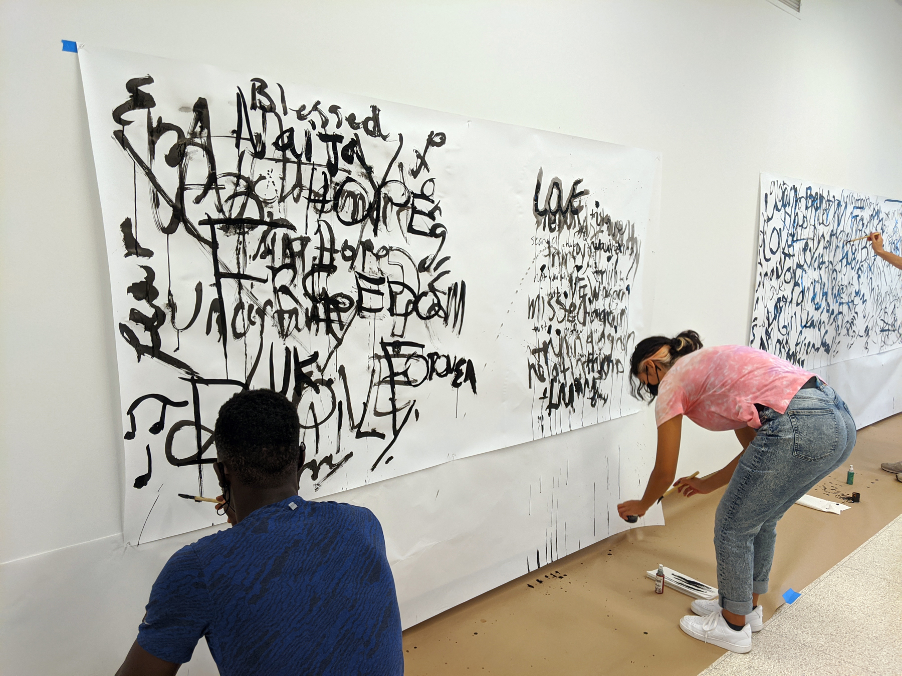
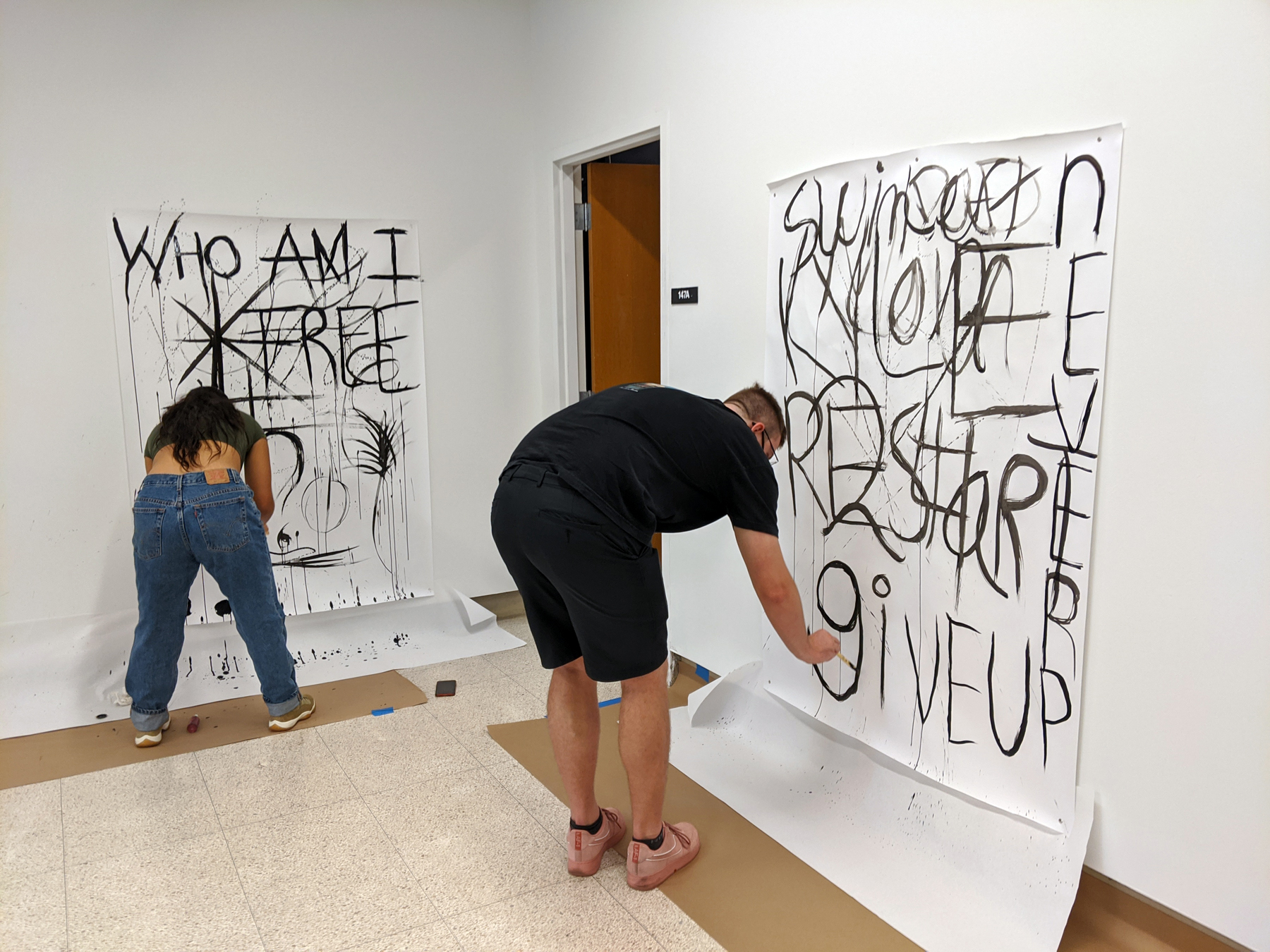
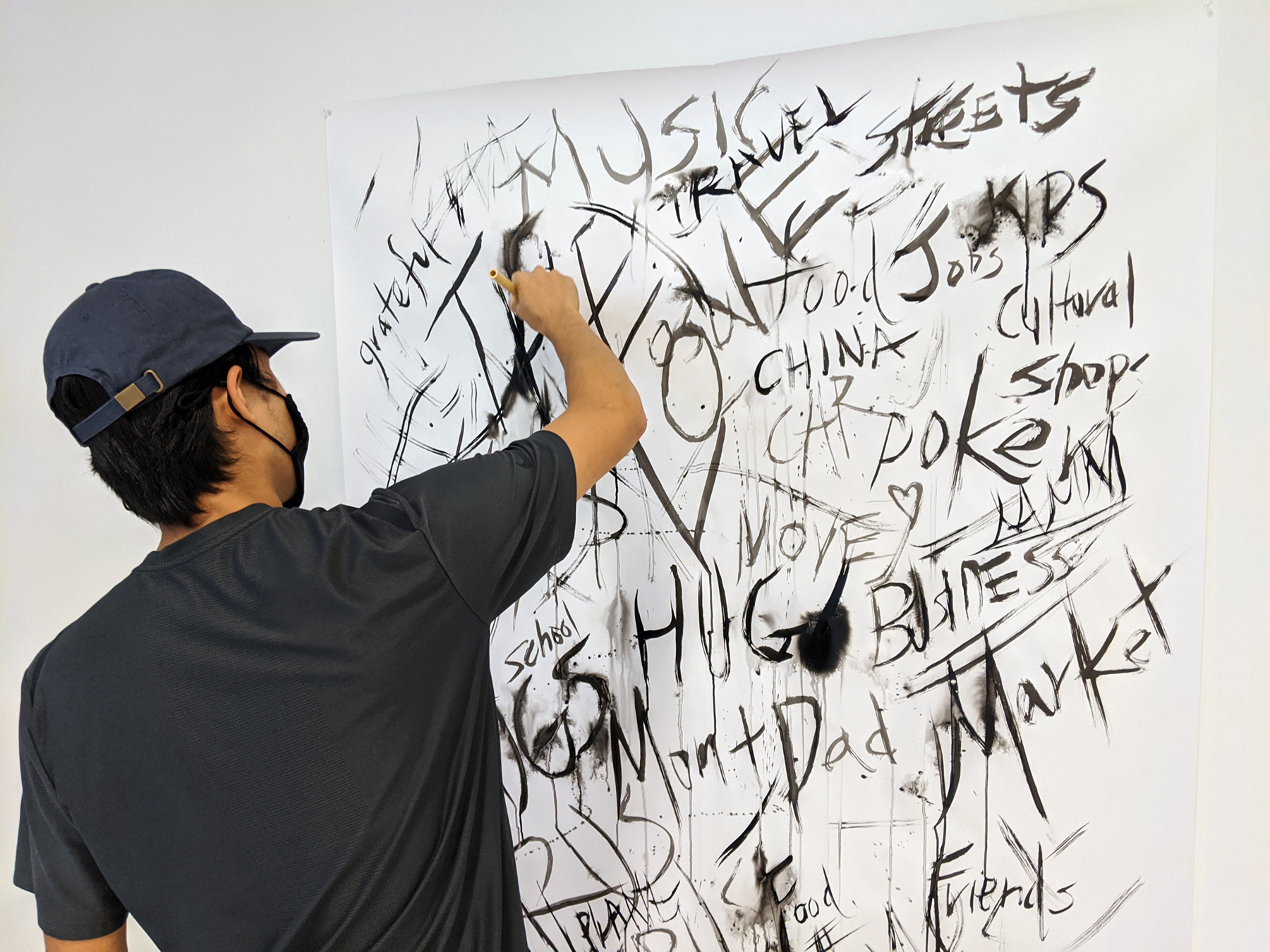
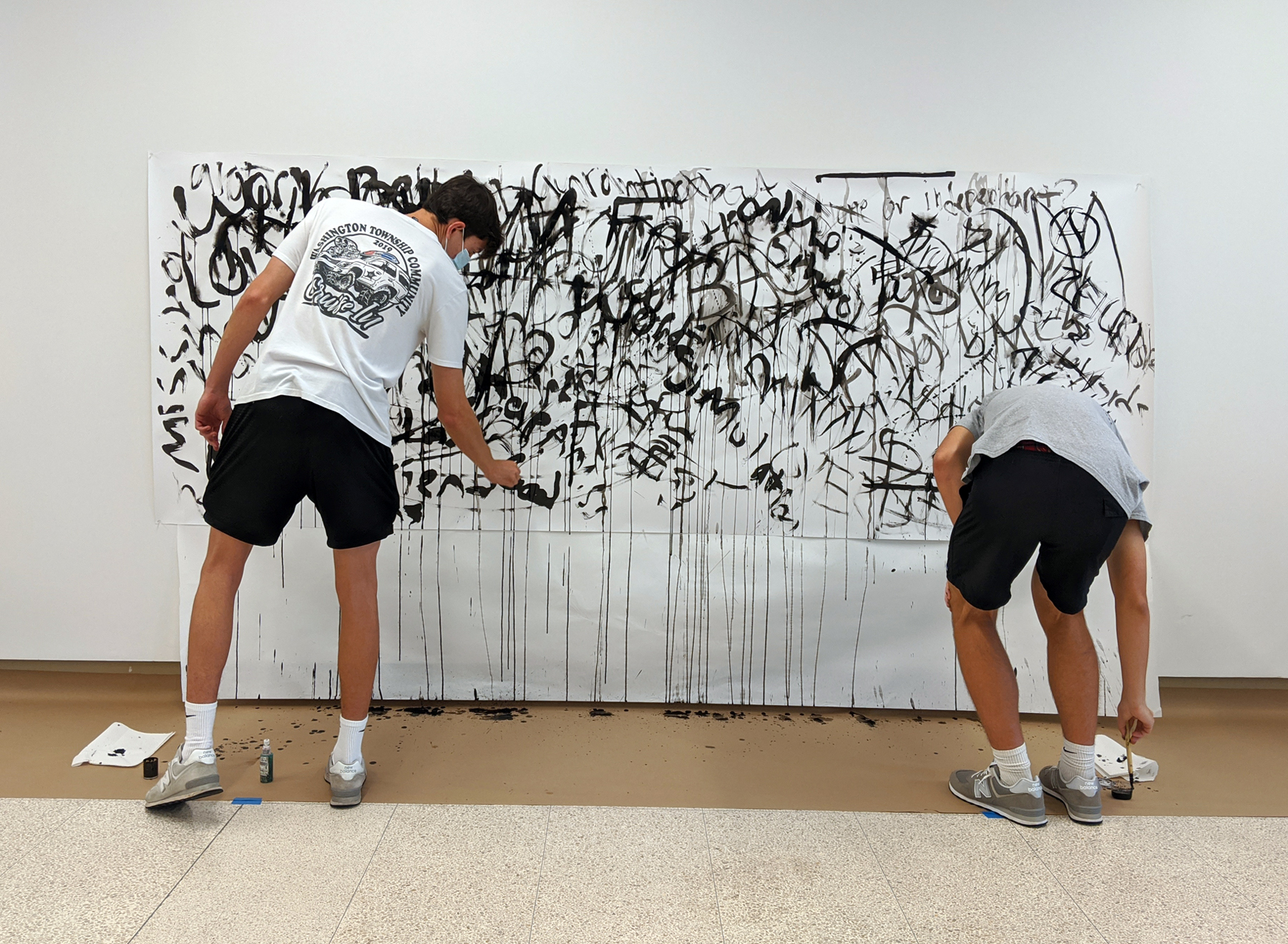
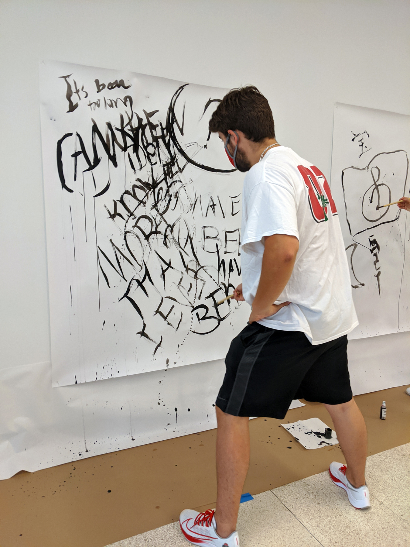
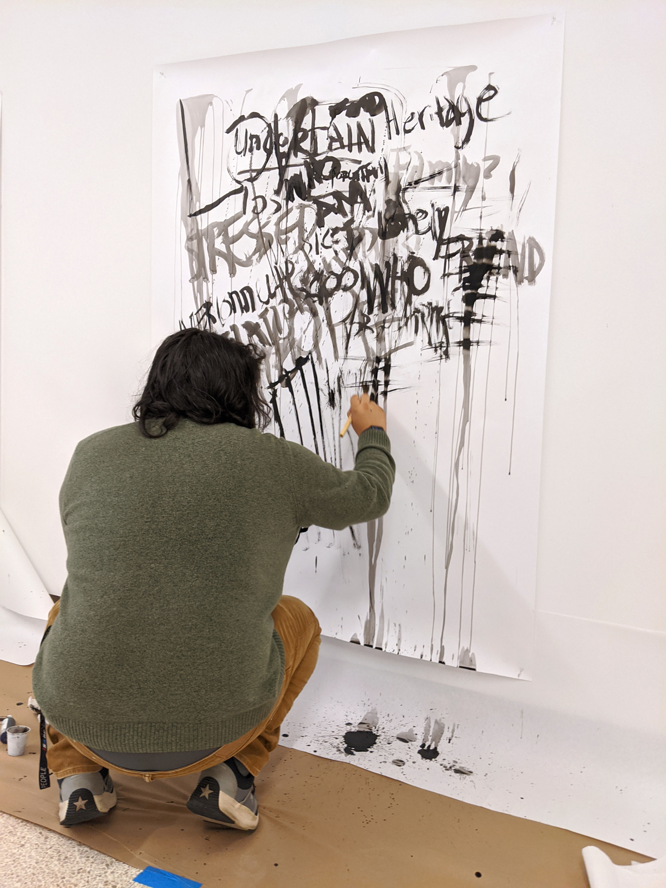
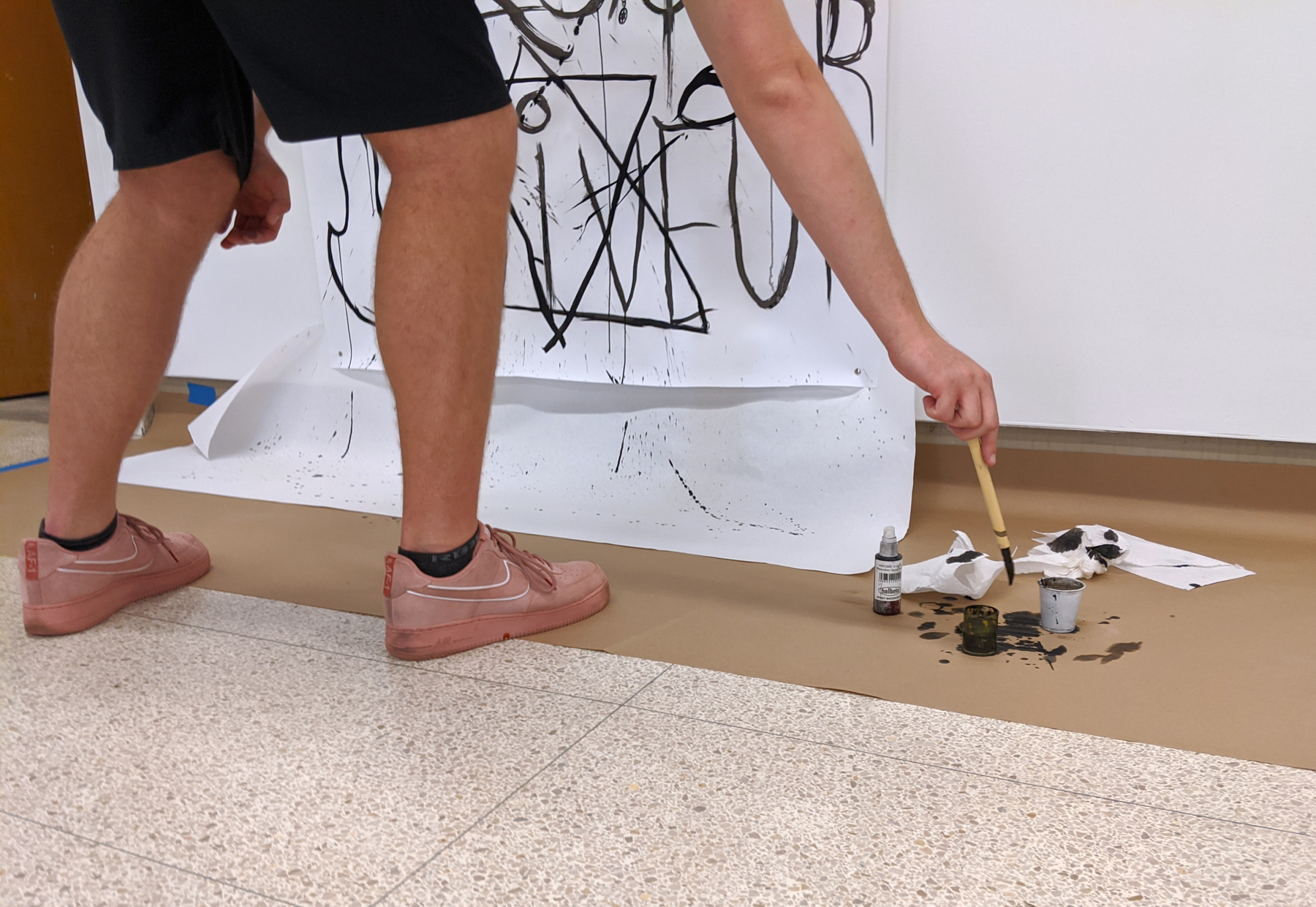
Rapid Fire Text is the result of an improvisational ink workshop facilitated by Lori Esposito, P.h.D candidate in the Dept of Arts Administration, Education and Policy with her class “Visual Culture: Investigating Diversity & Social Justice.” Taking inspiration from poetry, jazz, and graffiti, this rhythmic drawing approach merges the expressive potentials of ink with the written word. “Rapid” implies speed, quickness of movement and thought. “Fire” calls to attention the potential power and explosiveness of speech and the written word. Rapid Fire Text acknowledges forces that can manipulate, elevate, sensor, or silence. Harnessing this ancient fluid media (ink), students become familiar with how duration and speed can function as tools for developing their writing, self-representation, and expression within a classroom community.
Hybrid Arts Lab is a multi-venue teaching lab that experiments with how art is imagined, made, viewed and understood within physical and digital spaces. Venues include Hopkins Hall Gallery, Stillman Hall Tent, and online @ UAS from Home.
About the Improvisational Ink Workshop
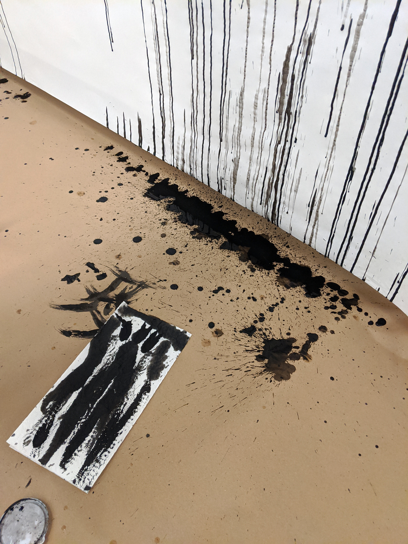
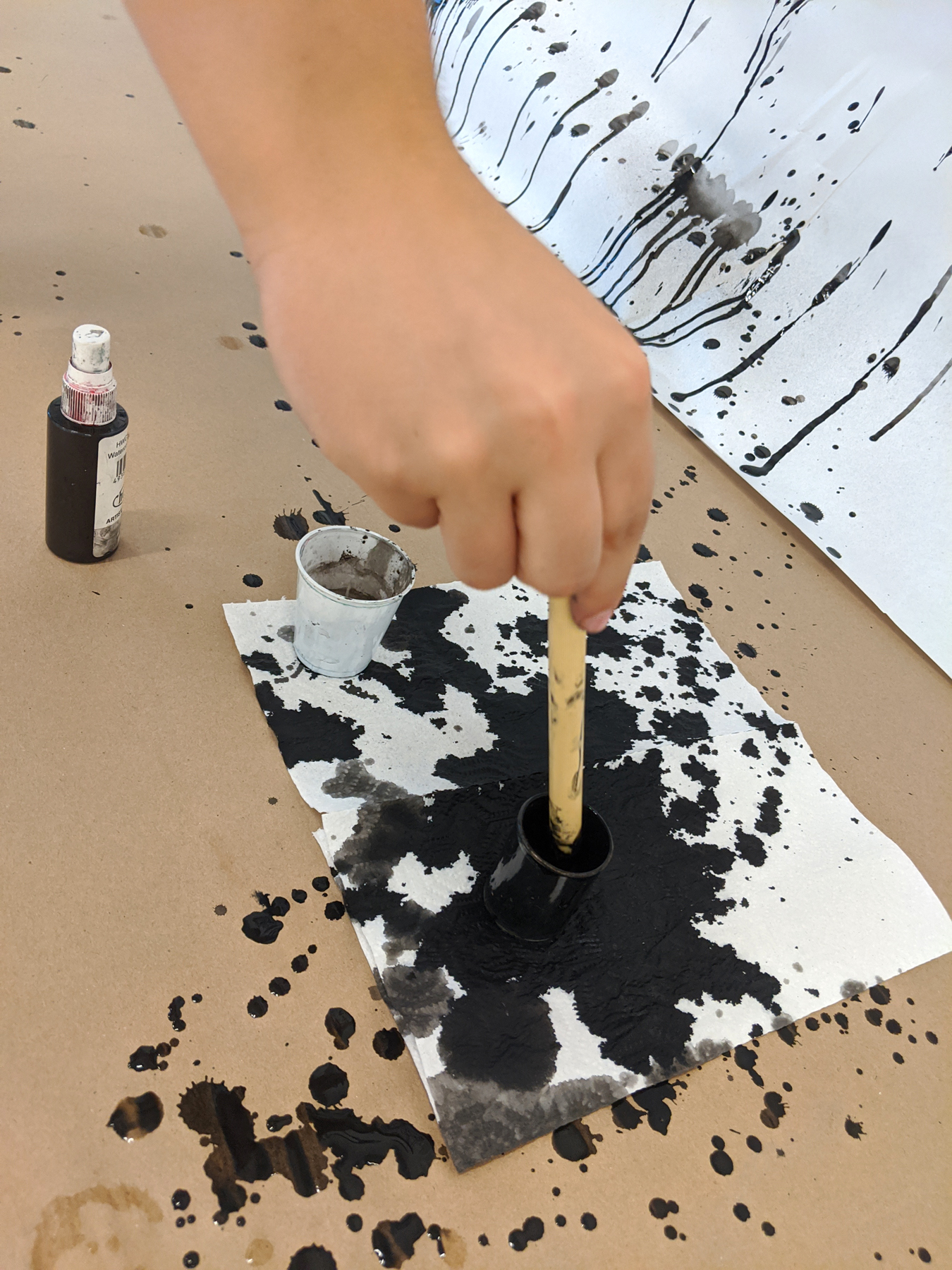
Though a series of durational works, students practice syncing their physical movement of painting with the pace of their thinking. By the completion of the event, their drawing surface is saturated with layers of calligraphic text. These surfaces may be excavated for meaning or remain semi-illegible. The materiality and viscerality of ink may be interpreted as expressive marks or it may deliver more nuanced messages as does the written word.
The improvisational ink workshop experiments with an alternative platform for developing material-led thinking processes that foster meaningful in-class discussion. The student is invited to apply various durations (1 minute to 3 minutes) to structure their thinking processes. The event facilitator introduces the materials and provides durational prompts. Students are asked to express themselves through the materials and express their culture and identity as pertinent to the context of the course (ARTEDUC 2367—Visual Culture: Investigating Diversity & Social Justice).
Student Reflections
Participating students selected a work other than their own and drafted a short reflection.
"I feel that, with current social situations, the main emphasis is on the lack of love we have for reach other today, and we need to become more united. Divided by racism and hatred, love becomes a more difficult goal to attain. In this piece, love is surrounded by dark and claustrophobic words that almost black it out. As you reach to the further corners of the piece, the lack of legible words show only the raw emotion to be felt from such events that have plagued us and prevented us as humans to connect."
-Jeremiah Maya
"A handful of noticeable words are; blessed, change, time, fear, and love. In his piece, the artist is blessed in the situations they were put in as well as what they have achieved. They have experienced change throughout their journey that could have brought fear. Above all they were loved throughout the process and they are happy to be where they are. I would say this work relates to graffiti, in a way, as it is erratic and emotional. And possibly poetry because of the placement of words. Finally, it is abstract art because no matter what everyone will interpret it differently."
-Jonah Cooper
"This piece relates to the identity, culture, and societal influence of visual culture. As we can see, the artist shared words sparking from their mind, their own thoughts and emotions that inform us a little bit of who they are, revealing a small glimpse into their personality. Certain words and phrases such as change, new, beauty, love, express how the artist was engaged in the environment around them, the culture of the world expressed by the words he chose to display on the paper."
-Nick Fox
"This artwork relates to cultural studies, art history, and performance culture. In American culture, sports are very popular. They are a form of entertainment that Americans invest a lot of time and money into. The art history behind this artwork is its relation to ancient art of indigenous people. Many of them left artwork similar to the lines and scribbles in this artwork. They symbolize hidden concepts. The last form of visual culture this artwork relates to is performance art. The images and lines show a flow of movement that remind me of people and objects moving, which is almost like a performance."
-Cassandra Garcia
"Given the fact that this piece was made by two people and that the artists combined their words in the middle, it makes me believe that the two artists were either comfortable with each other, or comfortable enough with themselves to connect their thoughts and feelings. Additionally, I think these two artists are in two very different places in their lives. The left side gives me more soft emotions through the words used and curved lines, whereas the right side uses sharp lines and gives me feelings of anger."
-Emily Hyatt
"This piece had many components. It contained conflicting words such as loud and quiet, together and alone, and self and family. This artist used different properties of the ink to create depth, with some words darker than others, emphasizing some more than others, and letting some words wash away into the background. I took from this piece the personal journey of one’s self. Through frustration and conflict of emotion, especially through use of a dark and bold exclamation point; turning to self judgement with the words ‘LOUD’ emphasized and then ‘quiet’ being dry brushed in the background. I felt this piece then grow and show the end of the story being self-improvement, using words such as Self Love, Grow, and Discover."
-Beck Kotalac
"I notice that most of the words drip down, which reminds me of blood dripping down. The next thing I notice is the splatter which reminds me of the aftermath of a gunshot. Something else I notice is that the words varying drastically in size and font. Some words are huge and smear, where as other words are small and sharp. The word scary is clear and probably represents how one views their own mental state. This whole painting, I feel, represents the inner struggles and darkness that we try to repress. This ties into American cultural perspective, that mental issues are your own problem, you should just suppress/hide them. This reminds me of the Joker from Batman, in a way. In the movie The Dark Knight and Batman v Superman this text in this piece is similar to the Joker’s graffiti. This artwork also seems to resemble graffiti of an angry or mistreated neighborhood that is fighting for change. Fighting to feel normal."
- Mustafa Mahmoud
"The word "friends" stands out. Particularly, the part where it fell off at the end. It makes me think that there could have been some kind of falling out or growing apart. I like the Pac man drawing. It is different compared to the rest of the painting. This and the word "games" was a change of pace, in comparison to the other words. It brings a fun aspect to the piece and the artist. A compass could be interpreted as looking for direction.
The design reminds me of what I’ve seen recently in BLM protests. I like to relate things to what I’ve seen and know."
-Alex Martini
"Some words are not possible to read because they have been overlapped with other words. The sizes are not uniform. Some words are written more than once. I feel that, with any different medium, these would not look as good. Words are written on top of each other. No standout theme encompasses all of the words. The artist's work is a reflection of life because it has a lot of words that may be personal to them, like mom and dad. They have an eye for style because some words like streets has this slick font, and the word hug is a lot bolder and blockier."
-Alex Merana
"Punctuation marks are widely recognized symbols throughout different cultures and languages. It is a different type of universal symbol that is understood by many and emphasizes emotion. In this work, punctuation marks emphasize emotion or doubt, to hint at the uncertainty or confusion of a thought. The slanted words indicate haste because it is more sporadic and less consistent. The artist chose some words to be faded as if they were an afterthought when their ink was running out. These words were not the first thing to pop into the artist's mind after dipping their brush in ink, but the last thought before refreshing and adding more ink to the brush."
-Kathryn Miller
"We have seen some of these styles of art in the recent protests throughout the past couple of months. I think this artwork also represents social media and how some people express their emotions and feelings through their own social platform. I also think that the darker words represent anger and I think that is what a lot of people are feeling right now in the world because of the coronavirus, protests, climate change and so on."
-Cullen Moore
"The piece is as powerful as it is bold. Not much canvas is visible but the words you see really portray messages that are almost trying to teach you something. I get connotations of protester art when looking at this piece. The piece has so much script, boldness and emotion within it, it reminds me of art you would see in a protest. The art also feels unstructured and emotional. The lines and the textures within it vary. The visual importance of the BLM movement screams out to me in this piece. It is like a visual image of someone’s thoughts crowding their head with all the words and phrases that have affected black people and they want to escape."
-Praise Olatoke
"The piece I am writing about is made by two people, which made it look more powerful to me. In the top left of the paper I can make out the word love. As for the rest of the writing, I couldn’t really comprehend it. This adds to the idea that text can create such a chaos in one’s mind, which made the piece more interesting to me. A few words I could make out on the left side were anger and bravery. These two go hand in hand with love. There are also drips of light wash ink dripping down the page, almost making the words look like they are bleeding, like and open wound. Putting one’s thoughts onto paper can be like exposing oneself, which is why I think it was fitting to say the drips resemble a wound, as well as the fact that sometimes being vulnerable can hurt you."
-Marcy Paredes
"Artist was in a good headspace — I claim this because of the artists use of positive words and symbols (hearts shapes and words like Love and Grateful). The artist was portraying physical things that they enjoy. I can see the words Food and Music and Family, all of which show a value on certain physical things in their world. The artist values openness and has confidence in their work. They didn’t cover up or cross out very many things at all. The sketch-based nature of this peace reminds me of the new wave of sketchy text-based advertising that we are seeing a lot of today. The rhythm of this peace reminds me of contemporary hip hop, especially the effective use of a select number of words."
-Justin Scherer
"I interpret the words family and friends, as what this individual values the most. I also notice a lot of lines throughout the artwork, this could be the artist trying to separate its ideas into different areas. The artwork kind of gives me an optical illusion, the more I looked at it the more I see a mountain range and valleys with the lines across the board. It is a possibility and it relates to the west U.S. with mountain ranges or maybe overseas somewhere. This could be a form of visual culture from where the artist is born. The compass could be speaking somewhere else in the United States or somewhere overseas. The mountains and compass are the big influencers on my read."
-Drew Shipley
"This piece is centered around a hierarchy of ideals, that can be displayed by clarity, position on the canvas, and time at which the words were painted. At the bottom of the piece the words depicted are much more abstract. They are intentionally darker, harsher, and were painted with much broader brush strokes than those that can be seen at the top of the piece. These words are almost unreadable, as they have been mostly covered up by a large blotting of ink that covers many of them. As the eye moves towards the top of the painting the viewer will begin to make out more understandable words, such as relationships, or friend. These words, while still broad, are much gentler and have a lighter value than those seen at the bottom. Reaching the apex of the piece the viewer will see the words Love, Heritage, and Hope very clearly, written last as to be on top of all the other words painted on to the canvas. This technique helps to show a hierarchy of beliefs, and what is most important to the artist. The use of writing makes me think of protest, especially now, as many across the country are fighting against police brutality and racism. From my view, these protests and this piece are both in support of love, heritage, and hope."
-Will Turner
"Words like Me, Live, Believe, Let go, Breath, Experience, stress, and good have created a theme for this painting. As I focused on the canvas I read all these words whether they were overlapped, faded, big, or small the message is that it's good to let go of the things holding us back and it's healthy for us to just breath and relax sometimes.
I feel like this artwork relates to graffiti and like street art because we didn't have much direction when we started painting, we kind of just painted what was on our minds. Another form of visual culture it relates to is peaceful protesting because the canvas has a message on it and so do the signs of peaceful protest."
-Charley Tzagournis
"Between the words and symbols, there are lines filled in. The word "outside" is on the top, which may indicate that the author enjoys being outside. The big scale and lines make a map of the author's mind and the map of adventure that the author likes. At the top and bottom of the paper I see hobbies. In the middle section, I see the words family, friends, and cousin, which may represent in the author's deep heart, that those are the most important things for them. As a map of adventure, it may represent that they like to try new things and explore the world and self."
-Zijun Yang
"In this piece, the artist emphasizes music. There is a music symbol encased within lines, which is located in the center of the piece. While this piece is very busy, the empty space around the music symbol makes it stand out. Compared to the others, this artist decided to use very few words, however they are written in rather large font. This creates more emphasis on the words and allows a more direct attention to each of the words. For example, the word “Miss” is written with ink dripping from the bottom of the letters. This ink drip looks like tears, which could represent the sadness of missing someone or something. In the corners of the piece, there are little to no words, but rather large splotches of dark ink. This artwork definitely relates to self-portrait, as the words and symbols are all expressions of the artist."
-Leo Yu